728x90
.html
<!DOCTYPE html>
<html>
<head>
<!-- title -->
<title>Just login</title>
<!-- favicon -->
<link rel=" shortcut icon" href="img/favicon/favicon-32x32.png">
<link rel="icon" href="img/favicon/favicon-32x32.png">
<!-- css -->
<link rel="stylesheet" href="css/css_index.css">
<!-- semantic-ui -->
<link rel="stylesheet" type="text/css" href="semantic/semantic.css">
<script src="https://code.jquery.com/jquery-3.1.1.min.js" integrity="sha256-hVVnYaiADRTO2PzUGmuLJr8BLUSjGIZsDYGmIJLv2b8=" crossorigin="anonymous"></script>
<script src="semantic/semantic.js"></script>
<!-- bootstrap -->
<!-- <script src="https://code.jquery.com/jquery-3.5.1.slim.min.js" integrity="sha384-DfXdz2htPH0lsSSs5nCTpuj/zy4C+OGpamoFVy38MVBnE+IbbVYUew+OrCXaRkfj" crossorigin="anonymous"></script>
<script src="https://cdn.jsdelivr.net/npm/popper.js@1.16.1/dist/umd/popper.min.js" integrity="sha384-9/reFTGAW83EW2RDu2S0VKaIzap3H66lZH81PoYlFhbGU+6BZp6G7niu735Sk7lN" crossorigin="anonymous"></script>
<link rel="stylesheet" href="https://stackpath.bootstrapcdn.com/bootstrap/4.5.2/css/bootstrap.min.css" integrity="sha384-JcKb8q3iqJ61gNV9KGb8thSsNjpSL0n8PARn9HuZOnIxN0hoP+VmmDGMN5t9UJ0Z" crossorigin="anonymous">
<script src="https://stackpath.bootstrapcdn.com/bootstrap/4.5.2/js/bootstrap.min.js" integrity="sha384-B4gt1jrGC7Jh4AgTPSdUtOBvfO8shuf57BaghqFfPlYxofvL8/KUEfYiJOMMV+rV" crossorigin="anonymous"></script> -->
<style type="text/css">
body {
background-color: #DADADA;
}
body > .grid {
height: 100%;
}
.image {
margin-top: -100px;
}
.column {
max-width: 450px;
}
</style>
</head>
<body>
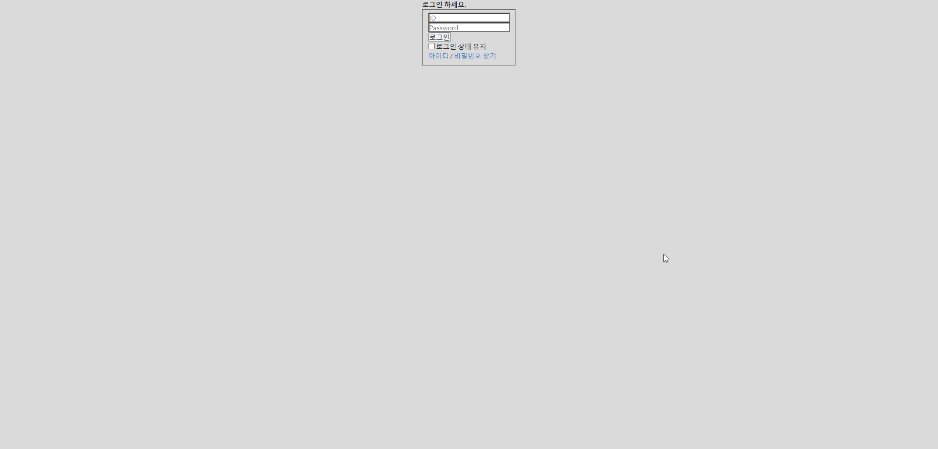
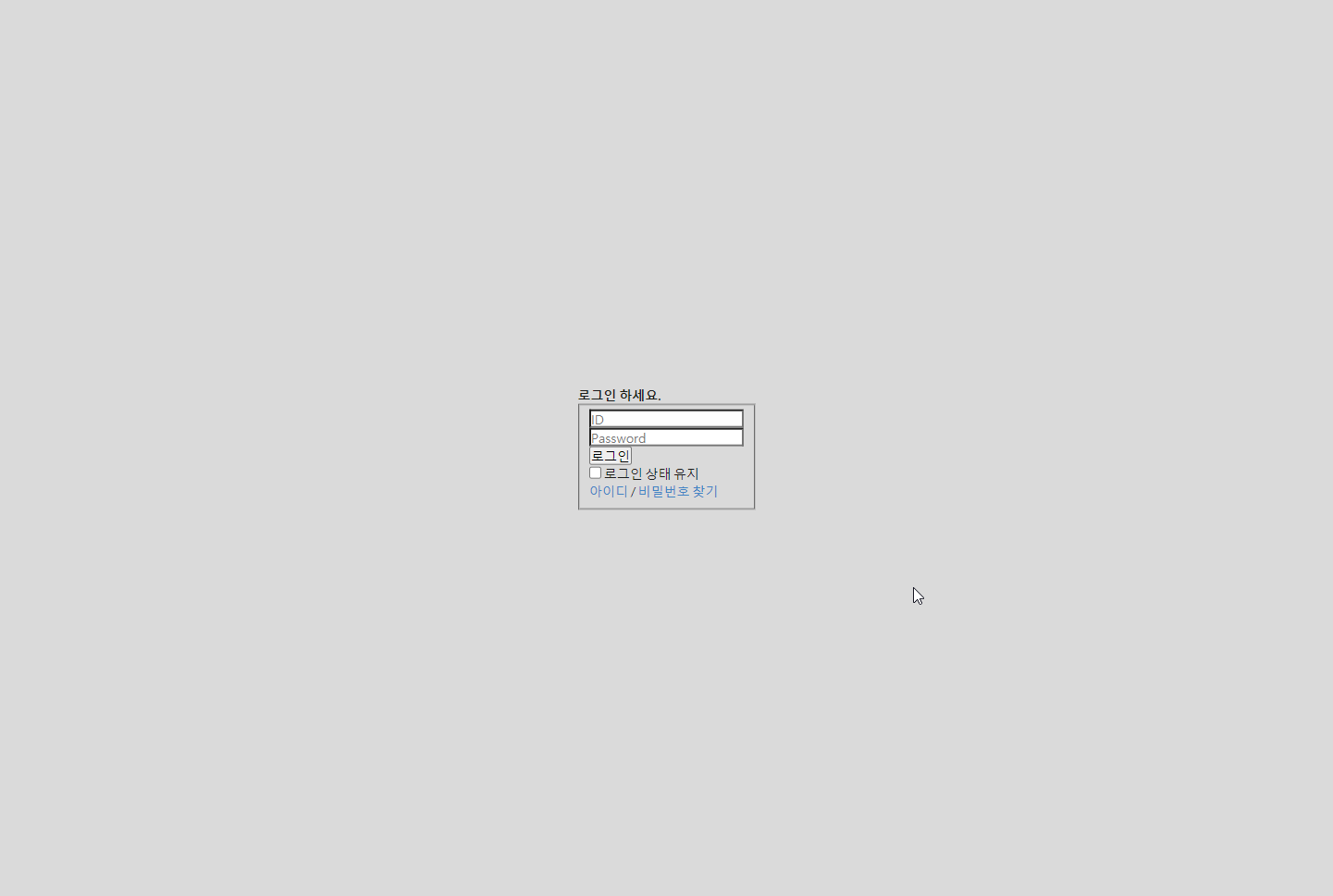
<h1 class="screen_out">로그인 페이지 입니다</h1>
<div class="login_page center">
<h2 class="screen_out">로그인</h2>
<strong class="title_login">로그인 하세요.</strong>
<form method="post" id="authFrom" action="html/login_auth">
<input type="hidden" name="when the form action the address for spending" value="https://www.tistory.com/">
<fieldset>
<legend class="screen_out">로그인 정보 입력폼</legend>
<div class="inp_text">
<label for="loginId" class="screen_out">아이디</label>
<input type="email" id="loginId" name="loginId" placeholder="ID">
</div>
<div class="inp_text">
<label for="loginPw" class="screen_out">비밀번호</label>
<input type="password" id="loginPw" name="loginPw" placeholder="Password">
</div>
<button type="submit" class="btn_login">로그인</button>
<div class="login_append">
<input type="checkbox" id="keepLogin" class="inp_radio" name="keepLogin">
<label for="keepLogin">로그인 상태 유지</label>
</div>
<span>
<a href="#" class="link_find">아이디</a>
/
<a href="#" class="link_find">비밀번호 찾기</a>
</span>
</fieldset>
<input type="hidden" name="fp" value="MFA(Multi Factor Authenitication) 다요소 인증 / OTP로 새로운기기에 접속 처리 등의 장치를 만드는 구문">
</form>
</div>
</body>
<footer>
</footer>
</html>
1. 블록 요소 수평 가운데 정렬
- 고정폭이 있어야함 ex) width: 300px;
- margin : 0 auto;
- 수평가운데 정렬
.center{
	width: 100px;
	margin: 0 auto;
}
2. 테이블 요소 수평 가운데 정렬
.center{
    display: table;
    margin-left: auto;
    margin-right: auto;
}
3. 수직 수평 가운데 정렬
.center{
    position: absolute;
    top: 50%;
    left: 50%;
    transform: translate(-50%, -50%);
}
4. 수직 수평 가운데 정렬
- 수직 가운데 정렬 align-items : center
- 가로 가운데 정렬 justify-content : center
.center{
    display: flex;
    height: 100vh;
    justify-content: center;
    align-items : center;
}
728x90
'IT > CSS' 카테고리의 다른 글
| [폰트] @font-face{} 적용하기 (0) | 2020.09.29 |
|---|---|
| [체크박스] checkbox & label 높이 조절하기 (0) | 2020.09.27 |
| [가상 클래스] first-child, first-of-type - 요소 선택하기 (0) | 2020.09.26 |
| [단위] 7가지(rem, vh, vw, vmin, vmax, ex, ch) (0) | 2020.09.25 |

